Data-driven design is when something is designed in accordance with sensible logic; that is, when the data proves that it should be designed that way. When we think data-driven design, we think analytics and tools like Google Analytics.
But data-driven design is about much more than that, simply because, data isn't always numbers and statistics. Sometimes data is written feedback or a video playback of a user test. Sometimes data doesn't come from users at all, but rather our own team testing the product in its very early stages!
Any information that is used to improve the design and user experience can be classified as data. With a lean UX workflow and collaborative design tools like Sympli, we can collect useful information on our first iteration to drive success to the next iteration. And we can do this as often as needed.
What is Lean UX?
A lean UX workflow is all about focusing on confirming what we think we know to be true, and reiterating over what we're wrong about or haven't explored yet (lean UX is all about "small doses"). Leaving design choices to be decided only by what's set out as "UX theory" and "user psychology" is a bad idea, because although the foundations for those theories are based on solid studies of user psychology, they aren't necessarily our users. They're just users overall.
Studies tend to focus on a widespread user base, but we need to test our designs on our users. That, of course, is difficult when you don't have an MVP (Minimum Viable Product) or users, so the next best thing is to request feedback internally.
Yep. Good old-fashioned teamwork!
Let's face it, the team who conceived the idea should have a reasonably decent outlook on how their future users will engage with its user interface. It's not a concrete solution, but like I said, it's the next best thing. User testing comes later.
Lean UX requires minimal resources, where the first iteration might be nothing more than a sketch. Less time spent on each iteration + more iterations means that we can accept feedback more often without necessarily spending more time.
Lean UX + Rapid Prototyping
Rapid prototyping and lean UX is the solution for early-stage concepts with no user base. Although Sympli is fronted as a design handoff tool, you can do so much more with it. Sympli is terrific for collaboration and feedback, and it doesn't require a finished design either. It doesn't even require a digitized mockup, as it's fairly easy to upload roughly-drawn sketches, as we discussed last week when we explored paper prototyping.
By capturing paper sketches with a device camera and auto-syncing to Dropbox, we can upload our sketched screens to Sympli (via Sketch) to request feedback early-on in the design workflow, way before something digital is ever created.
Whether you'd rather iterate with paper or Sketch, roadblocks are eliminated, bumps in the road are sidestepped, and we're able to do this without consuming too much time. In fact, ironing out the creases saves us time in the long run.
Exporting Designs to Sympli
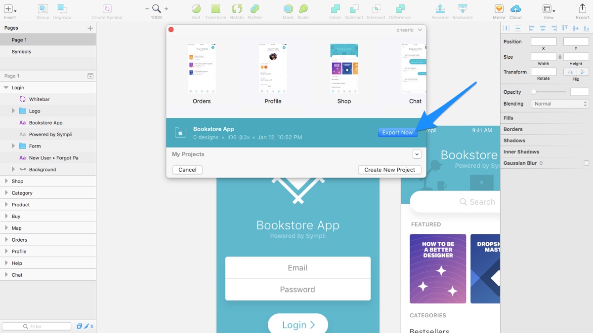
Exporting designs to Sympli little and often is what makes a lean UX workflow so effective. Whenever you're ready to hand off an iteration for feedback, hit cmd+Y in Sketch (or Window > Extensions > Sympli in Photoshop). Easy peasy.
Paper mockups can be synced between your mobile and desktop via Dropbox, and imported onto the Sketch canvas with ease.

Get Feedback Faster via Slack
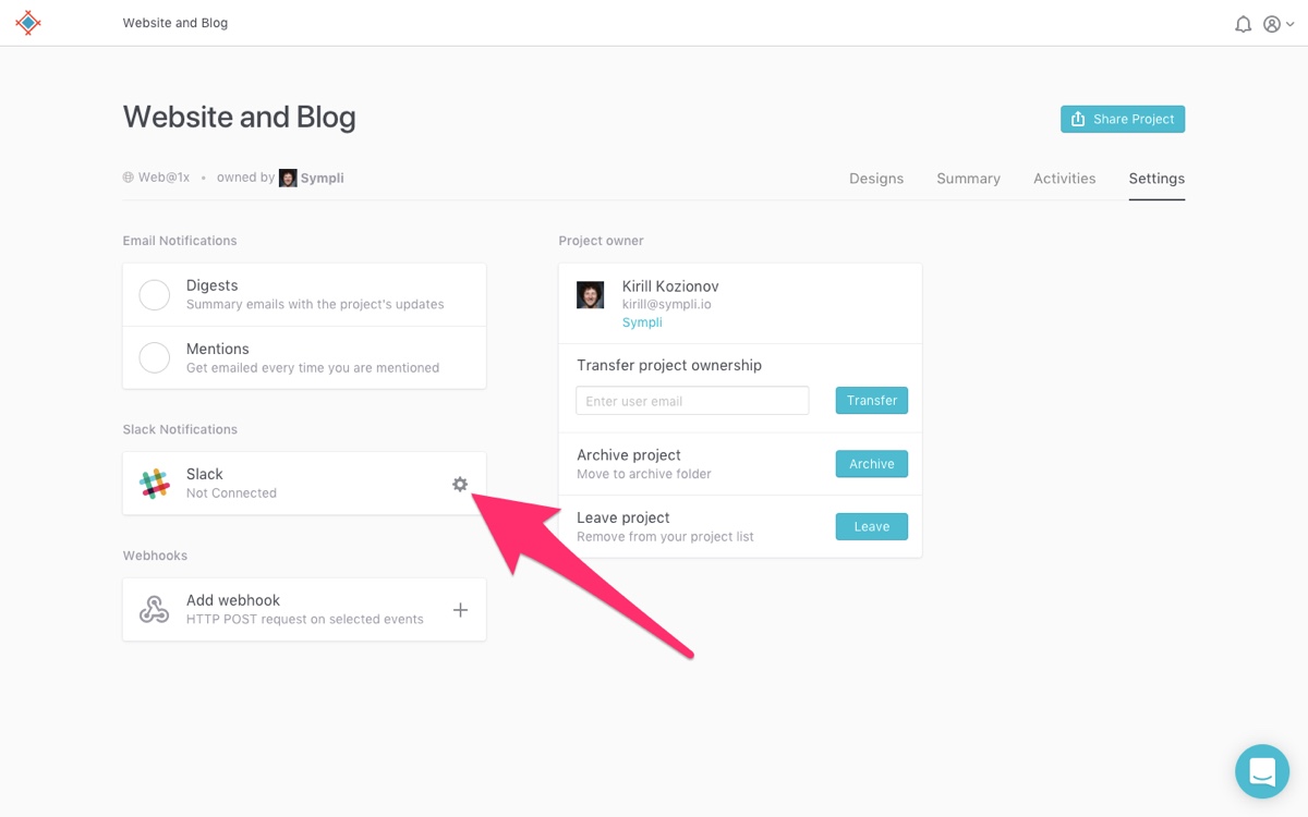
Our Slack integration can sync screens directly into the conversation, to alert team members when there's something new that requires their attention and feedback. To set this up, head to the "Settings" in Sympli.
Read our quick-start tutorial for more information.
Lean UX is for energetic teams. If it takes forever to collect feedback on each iteration, then you can expect a lot of waiting around, which doesn't help anyone.

Commenting in Sympli
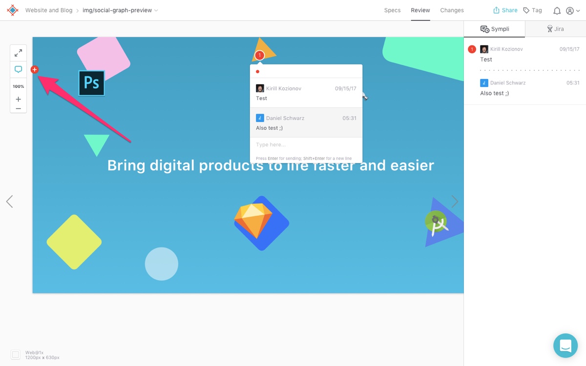
Now the comments themselves. In the inspect window, hit the comment icon, then the red + icon that appears, then finally where you want the comment to appear on the screen. Comments are threaded, so teammates can reply underneath.
Quick-tip: @mention teammates to seek their attention!

Comparing Iterations
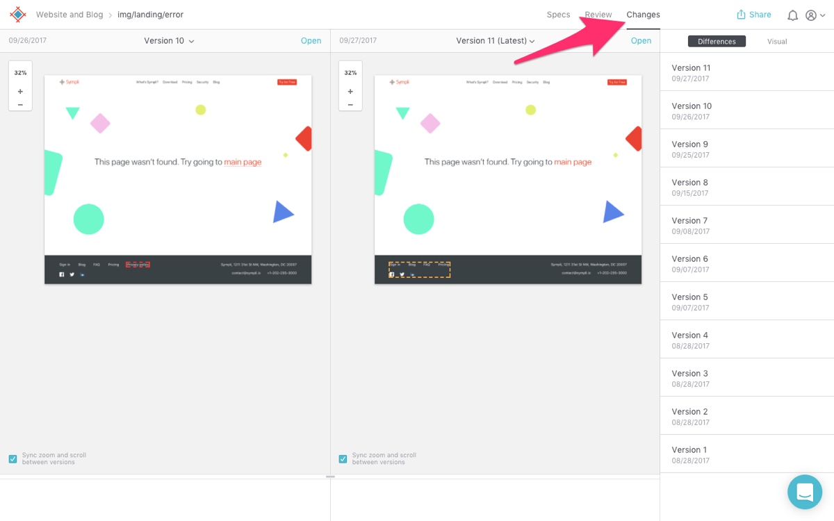
Also in the inspect window, hit the "Changes" tab to see what's changed visually. You don't have to play spot the difference anymore, Sympli highlights the differences so teammates know exactly what to comment on. You can easily switch between the versions using the version list on the right-hand side.
Quick-tip: when you scroll/zoom one version, by default, the other version auto-scrolls and zooms for your convenience!

Reiterate, reiterate, reiterate!
You've made some changes according to the feedback.
Now what?
Next, sync those changes into Sympli, and request feedback all over again! With each new iteration, designers should be fixing things, improving things, and then adding a little more fidelity so that the design gradually moves closer to the finish line. Things that your team aren't sure about should be reiterated, and things that are looking fine should be developed a little more.
———
Sympli lays the foundation for your collaborative workflow and helps you maintain that from start to finish. Have you used it to create and develop an MVP before?


