In recent years, the world has changed significantly in many ways and for many reasons. Specifically, the push to accomplish more tasks digitally without needing to physically interact with other people has created a huge shift in the way that we design user experiences. As a result, the majority of UX design trends that we’re seeing in 2022 are unprecedented.
With the first quarter now behind us, let’s take a look at the current UX design trends, whether they’re here to stay, and when and how to use them correctly.
Prioritizing Delivery Experience
The pandemic is changing the way that we do many things, one of which is how we acquire goods and services. Fueled mostly by the rise in on-demand delivery services, customers are beginning to expect faster and more transparent delivery experiences, onboarding experiences and digital experiences in general.
Designers must be able to convey trust by writing clear UX copy that sets expectations, displaying verified reviews and allowing customers to personalize their experience in accordance with what they’re comfortable with (e.g. contactless delivery, transparent customer updates, free trials without having to provide credit card details, etc.).
Accessibility
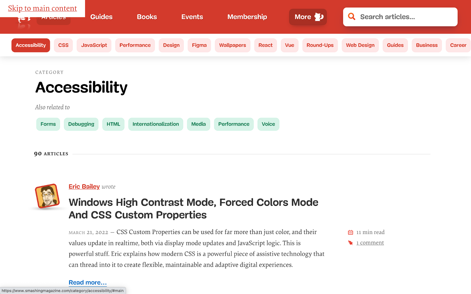
Respect for accessibility laws, such as the United Kingdom’s Accessibility Regulations 2018 (based on the well-known Web Content Accessibility Guidelines), is slowly but surely growing. As is genuine concern for accessibility overall.
Accessible design is long overdue and while there’s still a lot of progress to be made, discussions about accessibility are heating up and businesses are increasingly looking to hire designers with expertise in accessible design.
UX designers must design inclusive user experiences for people with all disabilities (who collectively make up 15% of the world’s population), not only because it’s the right thing to do, but also to avoid potentially alienating 15% of their reach, painting their brand in a negative light – or even amassing fines.
Hopefully, we’ll see accessibility laws becoming the norm, but more importantly we’ll see businesses actually adhering to them and thinking about accessibility beyond color contrast. Stay tuned, because this UX design trend hasn’t peaked yet.
Respecting Privacy Laws
In recent years, privacy has taken the center stage in discussions about ethical design, resulting in a number of privacy laws being enacted. The European Union’s General Data Protection Regulation (GDPR), the United Kingdom’s own version of it (GDPR UK) and the state of California’s California Consumer Privacy Act (CCPA) are the ones that are most talked about.
The good news is that we’re starting to see more and more businesses conforming to these privacy laws as well as other countries opening talks to enact similar laws as a result of consumers being more vocal about the many ways that companies mistreat their data.
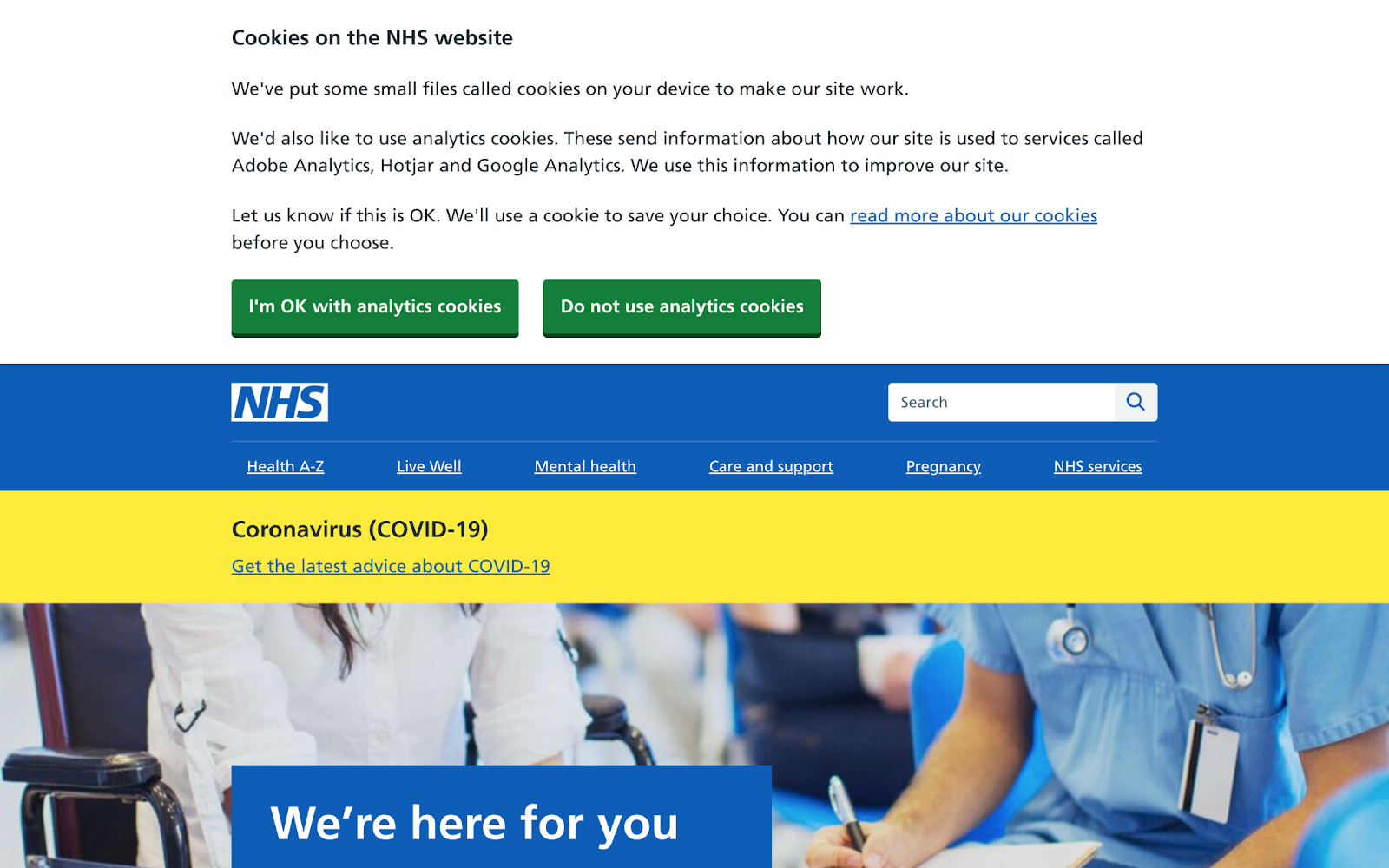
The bad news is that we’re seeing a lot of unnecessary friction in the user experience, which causes users to take actions they don’t truly want to take (such as accepting non-essential cookies). While it’s certainly a positive thing that businesses are starting to place more importance on data protection, users can sometimes feel as if they’ve no choice but to accept non-essential cookies and this doesn’t portray brands in the best light.
Not only should businesses care about the privacy of consumer data, but user experience design needs to be the driving force behind all data related decisions. This includes no non-essential tracking by default and the ability for users to reject non-essential cookies with a single click.
Social Advocacy

Businesses have begun taking stances on matters of politics, social injustice and social etiquette by changing their business practices, donating money to certain organizations and of course updating their apps and websites to include banners that explain how and why they support certain causes.
Apps and websites are being refreshed more frequently than ever before as businesses seek to find new ways to communicate with customers on a more social level. This helps businesses foster deeper connections with their customers and it’s important that designers and developers collaborate to push these updates in a timely manner.
Simplified Logos
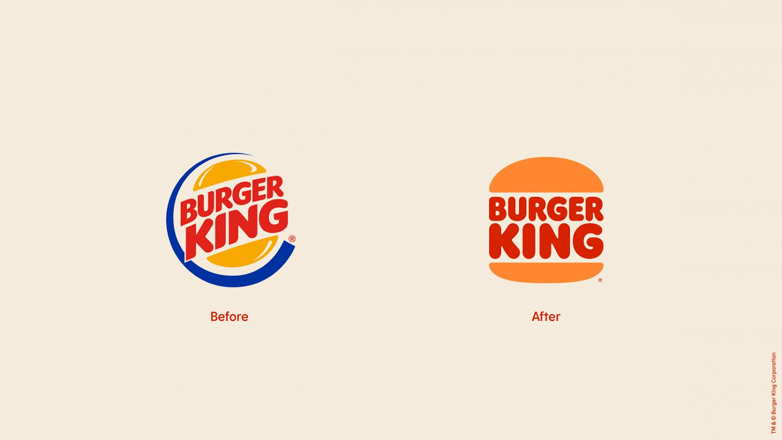
Not long ago we were starting to see many huge brands shunning their detailed (but recognizable) logos for something much simpler (Burger King, Warner Bros. and Mastercard to name a few).
The buzz surrounding this design trend is already starting to quiet down with simpler logos being fairly standard now. This is surprising because the majority of people appear to be against this design trend, so if you’re itching to design detailed logos with plenty of color or 3D elements, it might be worth considering it still.
The design doesn’t have to be final and businesses can even carry out small-scale testing if they’re especially hesitant to go against industry standards.
90s Nostalgia
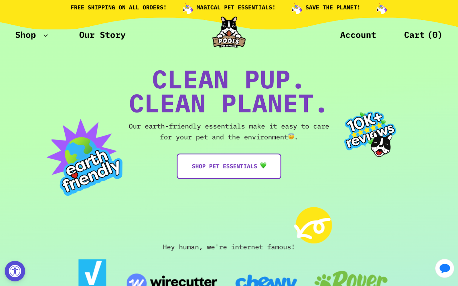
Nostalgia has always played a part in design trends because of the psychological effect that it has on people. One study suggests that nostalgia is an overwhelmingly positive emotion that boosts mood, raises self-esteem and increases optimism. In this particular moment in history it’s understandable that there’s a strong desire for things to be how they once were.
A visual aesthetic that’s proving to be especially prevalent is 90s nostalgia, which is rich with bright colors, heavy illustration and incredibly positive vibes. Naturally, this design trend makes the most sense for products in the beauty and entertainment spaces.
Glassmorphism and Neumorphism
Glassmorphism (a visual effect created using semi-transparent UI elements), was a huge trend for a hot minute. Based on iOS 7’s frosted glass look from 2013, glassmorphism reemerged on visual exploration platforms such as Dribbble but didn’t quite become mainstream due its poor accessibility and difficulty of implementation.
Neumorphism (a bevel/emboss visual effect created using very soft shadows).. Like glassmorphism, it should be avoided. Both trends create unnecessary visual clutter while not presenting any strong visual affordances (i.e. cues that suggest what an element does). Glassmorphism and neumorphism are unlikely to be trending going into 2023.
Conclusion
Rather than focusing on the latest ways that apps and websites are presenting themselves, it may prove more helpful to stay up to date on the latest trends in what consumers want/need while being aware of how businesses are addressing those needs. Using research methods such as competitor analysis, UX designers can discover how users truly feel about another business, including the UX design trends that they’re utilizing.
Most often, UX design trends aren’t inherently good or bad, it’s simply a case of knowing when and how to utilize them rather than using them based on popularity.
Sympli is a Saas company that creates tools for design collaboration, handoff, and version control. With more than 5 years on the market, we had helped thousands of designers and developers work together by providing a single source of truth and reducing back-and-forth communications, resulting in faster delivery.
