When working in a design file by ourselves it’s easy to forget that other people will likely have to navigate around our file eventually. Be that; developers, product managers or other designers. That means a good file structure and layout are important to get right and be consistent with from the beginning. There are a few different ways you can go about organising design files and setting out your folder structure and the method you choose depends on a number of factors.
Deciding on a Filling System
Depending on the size of the product you are working on you may have one or two design files that you and your team, work from or a number of smaller design files for each project.
The former is usually used if you are a contractor or an agency that is working on a product for a defined length of time. Having one or two files makes it easier to keep track of everything for a project. If it’s a website you can have the entire desktop site in one file making upkeep and updates easy to roll out across all screens. The only drawback for this is with very large systems or products your machine may struggle to handle such a large file and you could find yourself breaking it down into smaller files if this is the case.
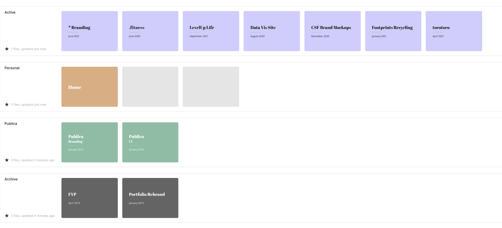
Keeping individual project files is more commonly used for in house teams who may have multiple designers working on multiple projects at once. With too many people working in one file things can get messy so having a design file per project allows work to be kept separate.
If you do have individual design files for each project your team works on you may also want to consider having one ‘main’ design file that is always kept up to date with the newest design for each screen. This file becomes the source of truth. It can help new team members get up to speed by browsing the application with a birds-eye view but it can also help when working on projects if you realise you need to update a page that already exists you can simply copy and paste it into your design file. Then when you are made the update you copy the updated page back into the main file. Thus always keeping an up to date main file.
Design File Collaboration
As designers we don’t tend to work alone in silos, we work with other designers, product managers and developers who will need to see our designs to implement the final product. But if your file has designs that are in progress as well as designs that are ready to be developed it could get confusing for those people unless you find a way to indicate the status of individual screens. There are two ways you can do this:
- You can specify a different page within your design file for different stages of the process. One page for designs that are in progress, one for designs to be reviewed and one for designs that are ready to be developed. The merit of this approach is that it’s very clear which screens are in which stage and there is no ambiguity. However, this means you will have to move screens back and forth across different pages and you may not be able to have a full end to end prototype if you are getting one screen at a time signed off.
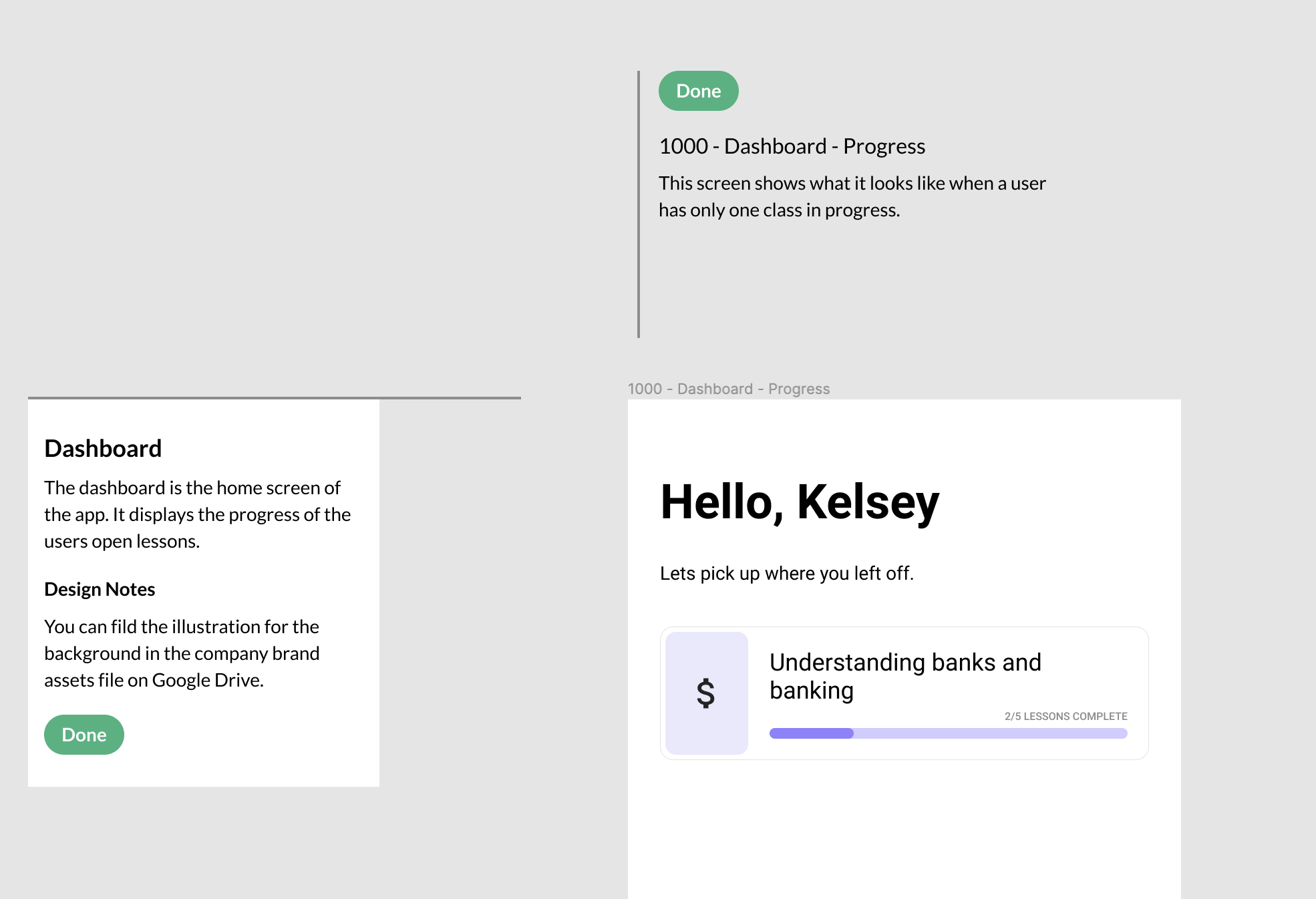
- Alternatively, you can have one page where all your screens are kept, allowing you to create end to end prototypes and reduces the amount of moving around. To do this you will need to add a ‘status indicator’ for each stage and depending on the size of the project for each flow. This status indicator lets people viewing the file know what stage that particular screen is in and can help give context if you add a title and a short description.
In File Organisation
Whether you decide to have one page with all your screens on it or multiple pages, you still need to figure out how to lay out your screens within that page. Luckily there is a fairly common convention for this already. Unless you are working on small updates to components, chances are you will have a flow of two or more screens that you are working on.
Flows are consecutive screens that come one after another as part of a task or journey. For example, a signup flow may go: homepage, sign up screen, authentication page, then landing page. Generally, people read and scan pages from left to right (there are cultural exceptions to this rule) this means that your flow should run horizontally from left to right, with the first page on the very left and the last on the very right.
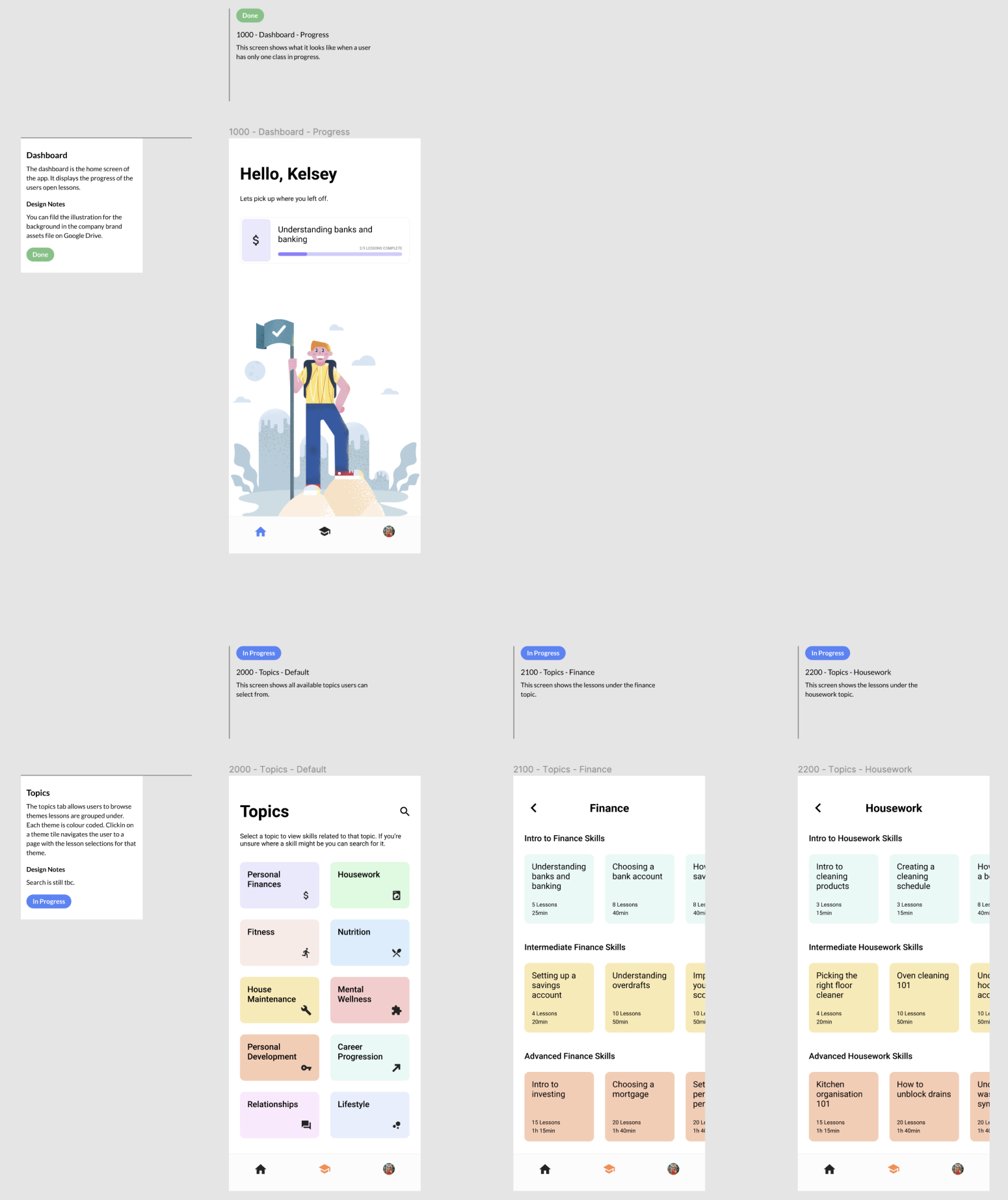
But what about states within a screen? When creating a sign-up flow you will also need designs for when there is an error, where should these go? Well, you can put them as part of the flow, but an alternative is to put states for a screen vertically underneath the default styling. This groups it together and makes it easy to scan the flow and ignore the peripheral designs until they are needed.
Generally speaking, design files nowadays have a pretty infinite canvas, however, if you do find yourself reaching the limit of your file you can group flows onto different pages by the section of the site or application they live under. You could have one page for Settings and one for Dashboard then the flows within these sections are laid out as above within those pages.
Naming Conventions
The most important thing when creating and using a naming convention for your design files is to be consistent across your screens, pages and files. There are a number of different ways you can choose to name your files and there is one main thing that will guide your decision; do you have to export your screens from your design tool?
If the answer to this question is yes (or maybe) you should consider naming your layers according to the flows they are in with forward slashes between them. e.g. Sign Up/Form/Error State. When you name your layers like this and then export them, they will automatically be grouped into files according to your naming structure. The above example would have a top-level file titled Sign Up with a file in it titled Form and finally in that form you will have an exported file titled ‘Error State’. This can make your life a lot easier when exporting large flows for client handover.
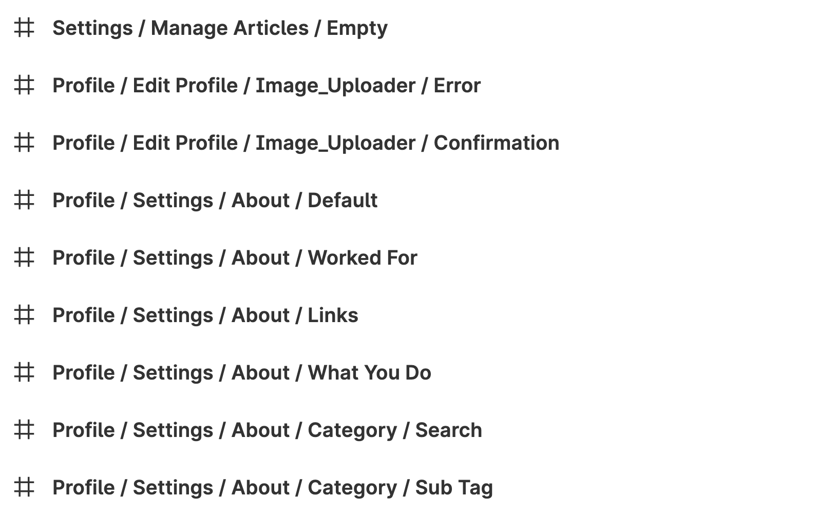
If you don’t need to export your files you can be a little more creative with your naming structure. A good rule of thumb is to continue to use Flow / Page / State however you could use dashed or underscores to separate these.
A relatively new concept in naming screens and pages within a design file is to assign them with numeric values. It follows the same principle of flows and states but instead of being descriptive, a number is assigned to each step.
Flows are indicated by 1000’s
Screens within a flow by 100’s
And states for those screens by 10’s.
These are then followed by a short descriptive title. Here is an example:
1000 - Sign up - Loading
1100 - Sign up - Default
1110 - Sign up - Email Entered
1120 - Sign up - Password Entered
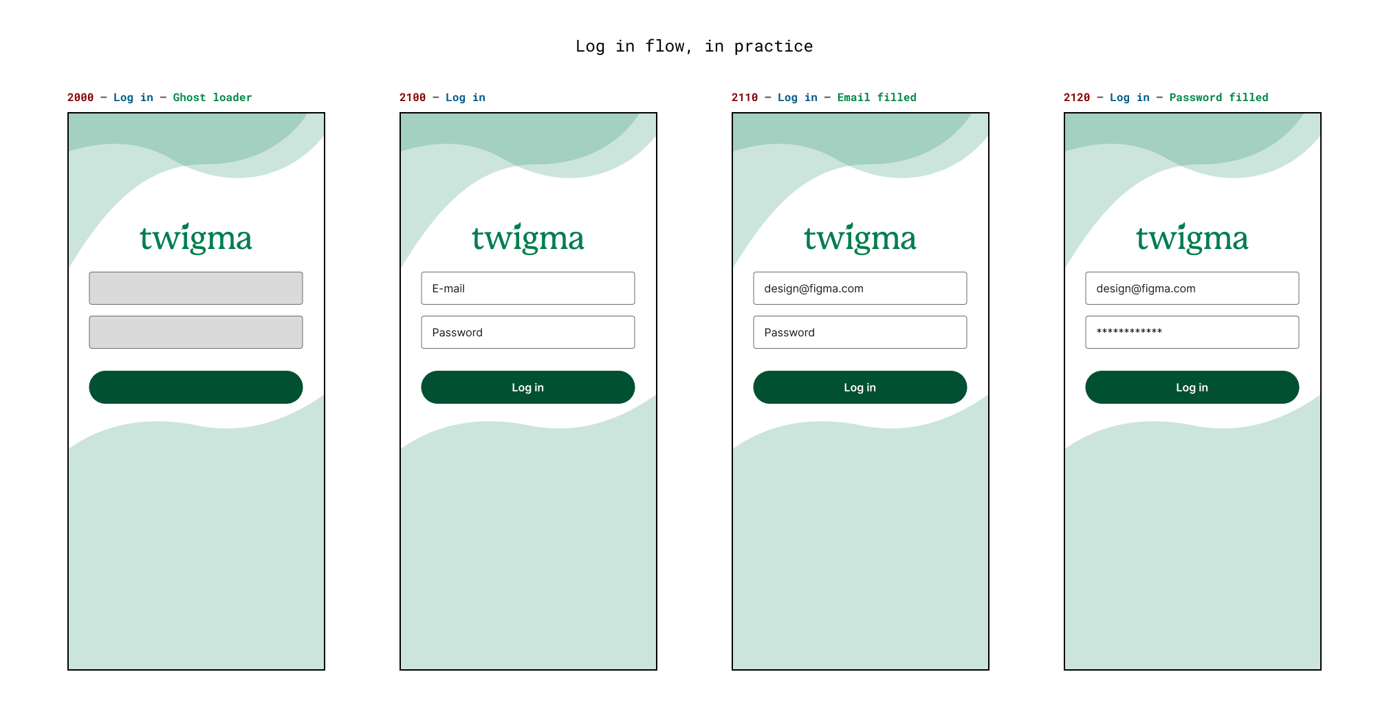
Using numerical values makes it easy to refer someone to a screen if they are unfamiliar with the file. Rather than having to read each Screen title in turn they can scan the list for the number of the screen they are looking for.
Hopefully, the tips and ideas laid out in this article help you organise and layout your design files in a way that makes it easy for others to understand and collaborate with you.
Sympli is a Saas company that creates tools for design collaboration, handoff, and version control. With more than 5 years on the market, we had helped thousands of designers and developers work together by providing a single source of truth and reducing back-and-forth communications, resulting in faster delivery.

