London buses are an absolute nightmare. I’ve been using them for more than 20 years, but regardless of how technology has changed the way we use transport in London, the user experience hasn’t necessarily improved. In fact, in some cases, it’s worsened over time. In most cases, the solutions to everyday real-world problems can be applied to the design of apps and websites too.
Let’s take a look at how Transport for London could improve the UX of buses, and how the issues and solutions can be translated to designing for screens.
Problem #1: Not Knowing Where You Are
Buses have a display screen that tells you the final destination of the bus, and the name of the next stop. Most stop names consist of a road name and nothing else, for example “Snow Hill”. If your destination was Farringdon, and you were on the 45 bus to Kings Cross, how would you know to alight the bus at Snow Hill for Farringdon? You likely wouldn’t. More information is needed.
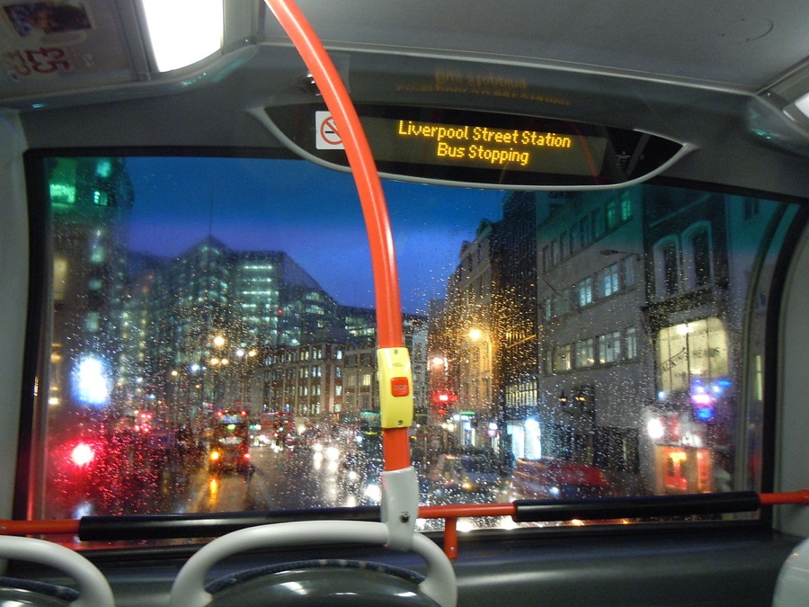
Display screens should show:
- Stop name
- General area
- Points of interest/nearby areas
In this case, the information would be:
- Snow Hill
- Farringdon
- Clerkenwell, Farringdon
Overall, this creates a lot of confusion, especially for tourists who don’t know the city all that well. But, if buses had a list of all the serviced stops and a live update on where you were at any given moment, it would be reasonably easy to decipher which stop is yours and when you need to alight. Prior planning and additional knowledges makes being in unfamiliar territory a less scary experience.
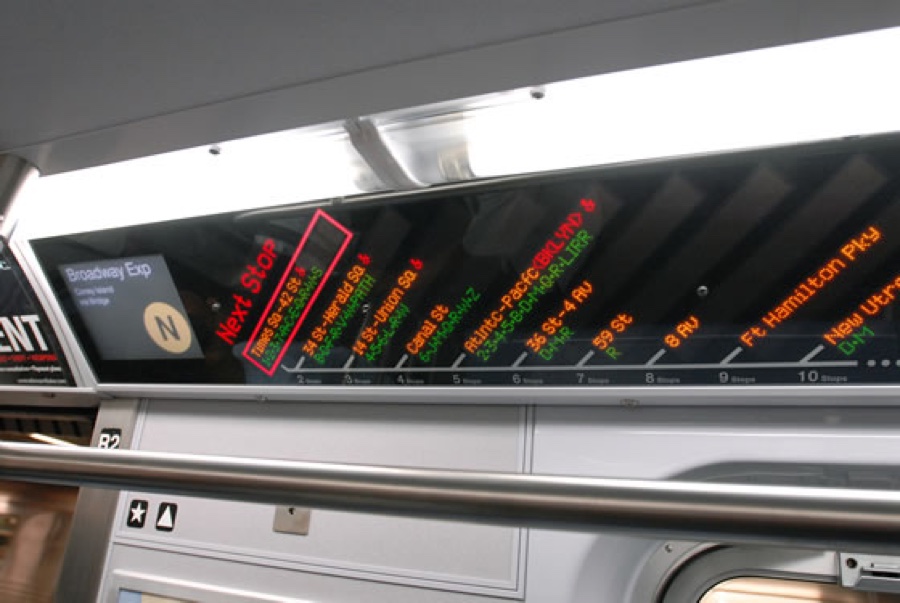
In many countries, the display screen on buses shows where you are, and what the next stop is, which is a better user experience. However, the interface used on metro transport (we call ours the “London Underground”, or “The Tube”) is much more efficient, as it shows all previous stops, the current stops, and all of the stops to come. Like I said, more information won't hurt the user.
How does this relate to website design?
Breadcrumbs and sitemaps of course! On larger websites especially, it should be easy for the user to navigate to other areas of the website, and for them to find exactly what they’re looking for without confusion. Clutter, no. Simplicity, yes.
Problem #2: Accidentally Overpaying
You can overpay in two ways on London buses.
Firstly, London buses take advantage of “Contactless” technology, so we can pay for the bus via our debit cards without having to insert our PIN numbers. While this is delightfully easy (we don’t have to top up our Oyster cards anymore!), if you swipe your wallet and you have more than one contactless bank card, you can accidentally pay twice! A two-second time-limit before you can swipe a second time could (and really should) be an ultra-simple solution for this.
Secondly, if a London bus has to terminate its route early (which happens way too often in London!), you must leave the bus, wait for another bus, and then pay again. Outrageous! Luckily, TFL have introduced a system where bus tickets are valid for up to one hour. Most other countries have been doing this for at least a decade, so this is something we’ve been waiting for for a very long time!
How does this relate to screen design?
Failsafes should be a thing of history, but unfortunately they’re not.
“Please don’t hit the Pay Now button twice!”
As users, we all make mistakes. It’s inevitable. Interfaces should be intuitive enough to detect when the user is about to make a mistake, before they make it. In the case of the submit button, you could make it grey/disabled while the backend code checks that the form has been submitted correctly.
Problem #3: Wheelchairs Don’t Fit in the Wheelchair Space
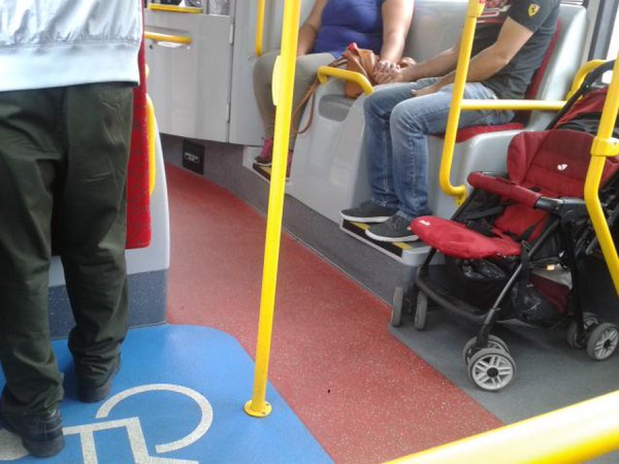
On London buses, there’s a handle rail that appears bang in the middle of the buggy/wheelchair spot (yes, the spot is for both babies and disabled individuals in wheelchairs, and “who has priority?” has been the subject of a long debate).
Occupying both spots in this reserved space is a challenge because of this misplaced handle rail. By challenge, I mean that various passengers (and the child/disabled person occupying the first space) has to adjust themselves to allow the second spot to be filled, an awkward, frustrating and sometimes embarrassing experience for all involved. In rush hour, this experience is worsened tenfold.
How does this relate to website design?
While the handle rail may certainly be necessary, this is what happens when designers try to cram too many important functions onto the screen at once, and this happens a lot with mobile websites with poor responsive design.
As the amount of space is reduced on mobile devices (like when more passengers board a bus), design elements need to be shifted around. An adjustable handle rail would solve this particular real-world issue, and in the case of responsive design, a combination of effective whitespace management, layout adjustments and some careful reduction (or what I like to call, “cutting the crap”), we can design uncluttered, adaptable, responsive layouts that don’t stall the user.
Problem #4: Bouncing Around the Bus Like a Pinball
Scroll-jacking is likened to when a bus starts moving while you’re still climbing the stairs on a double-decker bus. You’re trying to go somewhere, but you’re being forced at a speed that’s really not comfortable to you. The solution to this is simple: let the user navigate at their own pace. Pressure = lost user.
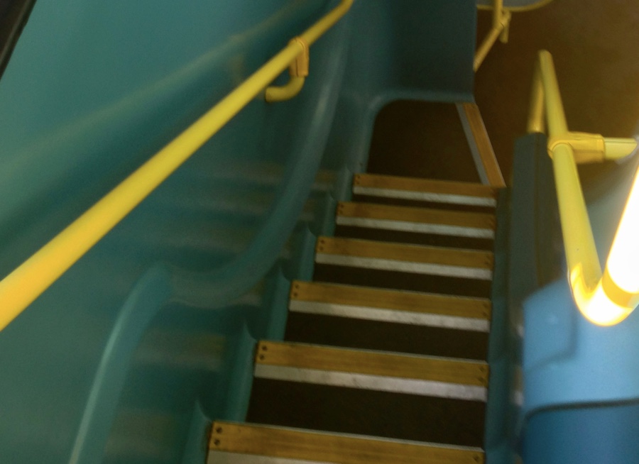
When a user doesn’t feel in control, it’s a very scary experience for them. Like when you’re reading the menu outside a restaurant and the front-of-house staff are trying to pressure you inside. It’s not fun, and the same applies to scroll-jacking websites that result in the user bouncing around the screen.
Conclusion
Observing your surroundings and solving bad user experiences in the real world can make you a better designer. Even though you’re a designer, you’re also a user too, and not only of apps and websites, but you’re a user of transport, retail stores, banks, technology, home furnishing…I could go on.
What everyday scenarios offer you a bad UX?
