What is information architecture?
If you have dabbled at all in the world of UX Design then you will likely have heard of the term information architecture or ‘IA’. But what exactly is it?
The concept of information architecture has been around for a very long time and has its roots in ancient Egypt where librarians listed out the contents and locations of books and texts in the library on a scroll, so they could quickly find the item they were looking for. However the first use of the term ‘information architecture’ wasn’t until hundreds of years later in the 1970s when Xerox coined the term.

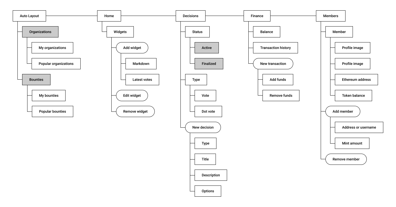
Information architecture is simply the way we choose to organise data or information within a digital product. An IA will map out each page within a website or application within a hierarchy. To create a hierarchy means to create a relative ranking between information. This hierarchy of information dictates what the information architecture is. You can see examples of information architecture in the navigation elements on websites and applications. Usually, the top-level item in an IA will be shown to users as a main navigation item. The role of an information architect can be an entire job by itself but is often included in the work of UX designers and researchers.
The level of detail you include in your IA is up to you and your team. Some people outline in-page features or functionality and even content. Though there are no set guidelines on what you should or shouldn’t include, at the very least your IA should outline the main pages or ‘data’ within your product. Your IA document doesn’t need to be fancy, you can simply use a spreadsheet tool such as Google Sheets or Excel, but if you do want something more visual you can use digital design tools such as Figma to create your IA documentation. Either way, the document will convey a visual hierarchy of data.
Why Is It Important?
The reason anyone uses a website or app is for the content within it. It could be a learning resource or an e-commerce site. Either way, people are there to explore, search for and discover content. The IA of a product will create structure and hierarchy for this content. A good IA can help your users find the content they are looking for quickly and easily. Quickly is the important word here, if users cannot find the content they are looking for because it is buried in a bad IA they may give up trying to find it altogether.
Creating a well thought out IA doesn’t just help your users navigate around your site it can also provide everyone within your company with a bird’s-eye view of the product end to end. This type of overview can be invaluable in helping new colleagues understand the product and find their way around it and can also be used to guide product decisions. Things like navigation layout and styling, breadcrumbs, and other way-finding elements will be dictated by your IA structure. Depending on the fidelity of your IA It can also help interaction designers and developers understand everywhere a page or feature is being used.

How to Create a Good Information Architecture
Anyone can create an information architecture, but simply creating one doesn’t mean it’s good. A good IA is based on researching and understanding the people and tasks that it is trying to support.
The psychological principles of IA
Before you can start to create your information architecture you should have a basic understanding of the psychological principles that play a part in guiding how we should be structuring our data.
Mental models
Mental models are the assumptions people have about how things are related to one another. For example, some people when looking for biscuits on a grocery shopping site may go to ‘cupboard items’ others may go to ‘sweets and confectionary’. This is their mental model of where that item should be. Mental models are subconscious, stored deep in their long term memory so ensuring the IA of your site matches your users’ mental models will help them find what they are looking for and reduce confusion.
Cognitive load
Cognitive load refers to the amount of data a person can process in their working memory at any one time. Too much data can lead to users feeling overwhelmed and stressed. For example, navigation with too many options can result in users giving up trying to find the item they are looking for. Ensuring your IA is simple and well organised can help reduce extraneous cognitive load and creates a simple stress-free data hierarchy.
Making sure you keep these cognitive psychological principles in mind when creating your IA can go a long way in ensuring they are easy to understand and use.

Research techniques
If you are unsure where to begin when creating your information architecture a good place to start is to do some research!
Card Sorting
Card sorting is a method of getting your users and stakeholders to organise the data or pages within your product for you. You can then review how they organise it and see if there are common organisational patterns across multiple participants. This can give you a basis on which to group and structure data according to those users mental models.
Card sorting can be done in person or remotely by using software such as Optimal Workshop so is a flexible and easy to run technique. You should start by creating a *content inventory* of every single page within your product. If certain pages don’t have consistent titles (such as listing pages on e-commerce sites) then you should assign them a descriptive generic name, such as ‘product listing page’. If you have time you should also do a content audit of each page to double-check each page is; useful, accurate and effective. This can help weed out unnecessary pages and slim down your IA.
You then take this list of pages and present them to your users, if you’re doing this in person you can use sticky notes where each page has a separate sticky note. If you’re doing this using an online tool it will walk you through how to set up your ‘pages’. You then get your participant to group pages they feel are related together, once they have done this they should then give each group a title. This technique can be used for organising small parts of an IA or creating whole structures.
If you have a particularly large or complex IA you may need to break down this task into smaller chunks and get participants to sort different sections of your IA.

Tree Testing
Tree testing usually comes after a card sort, however, if you are short on time or are working on a relatively simple IA structure you can jump straight to tree testing. A tree test is used to test the structure of an IA.
To conduct a tree test you should have created the first iteration of your information architecture. You then ask users to carry out tasks or find specific pieces of information using only the titles of the ‘pages’ within your IA. Generally speaking this is much easier to do using an online tool because it will hide the other pages within the IA and only show your user the specific path they are following thus ensuring they don’t accidentally spot a giveaway work on another part of the IA.
Tree tests can be used to test not only the structure of your data but the names and titles you give your data and their groupings. Your grouping of information along with the titles you give them is called taxonomy. Ensuring the taxonomy you use matches that of your users is important. What one person may call a cookie another may call a biscuit so ensuring your taxonomical structure is flexible enough so that both these people can find what they are looking for is important.
You can read more about conducting tree tests and card sorts in our article; UX Research: A Beginners Guide.
Bringing it Together
Once you have done your content inventory and audit, conducted your card sorting and tree testing and checked that your taxonomies match your users’ mental models you should be fairly certain that your information architecture is a good one. But remember times, terminology and mental models can change. So be sure to reevaluate your IA periodically to ensure it stays good.
Sympli is a Saas company that creates tools for design collaboration, handoff, and version control. With more than 5 years on the market, we had helped thousands of designers and developers work together by providing a single source of truth and reducing back-and-forth communications, resulting in faster delivery.


