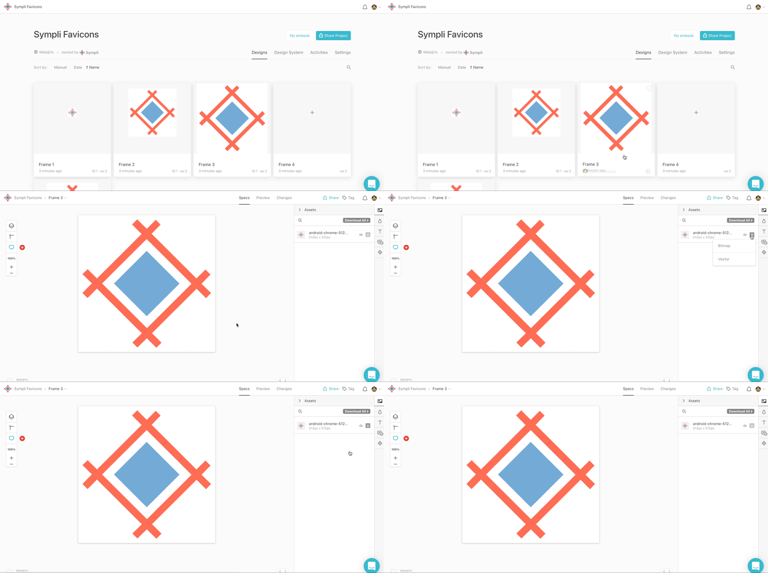
What is a favicon? It is the little icon that appear next to the webpage title in a browser tab. Favicons have long existed on the web, but since many websites are intended as web-apps these days, it’s commonplace to design app icons (known as touch icons) even for websites, and because device resolution varies on every browser and from device to device, those icons should come in a variety of sizes, so you can hand off the whole package of them to your development team.

Why Do Favicons Matter?
Why do you need a favicon? Users will remember and recognoize it, they would find a tab with your favicon among other tabs faster, scanning, as we all do, and not loosing time trying to read the tab name. Favicons also add to overall branding consistency and their absence might be seen as unprofessional.
Where Are Favicons Used?
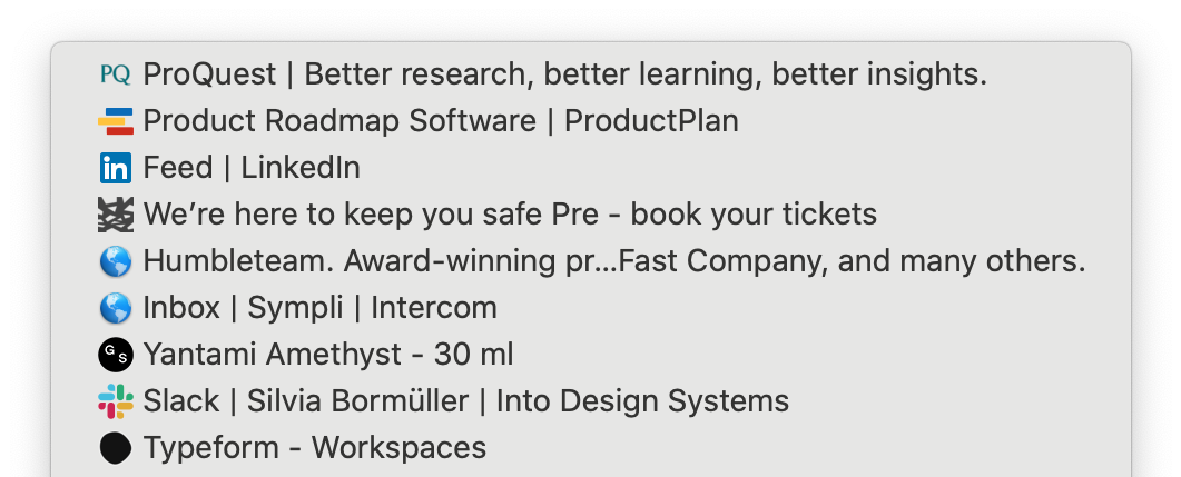
Favicons are used in browser tabs, browser history, toolbar apps, bookmarks dropdown, search bar, and search bar recommendations. In all of these, especially in the bookmarks and histoty tabs, that consist of lists of URLs all looking the same, the favicon makes it faster to find that web-site you're looking for.

Woah, that was a lot to take in, right? Let's run through favicon sizes and touch icons, and I’ll explain which devices use which icons, and at which size they require those icons to be.
Lets start with favicons.
Favicons
Back in the day, we used a little file called a favicon.ico , and this .ico file contained several .png files at a range of different sizes (because favicons, even back then, were also used for desktop shortcut icons). Since the introduction of the sizes attributes in HTML5, we don’t have to compress the .png files into an .ico format anymore (even though browsers do support .ico still). Favicons' format is always .png.
But which favicon standard sizes and dimensions (px) do we need to support?
- 16x16: browser favicon
- 32x32: taskbar shortcut icon
- 96x96: desktop shortcut icon (and Google TV)
It really comes down to what you want too create support for — this is the HTML5 syntax for displaying favicons:
<link rel="icon" type="image/png" href="https://cdn.yourwebsite.com/favicon-16x16.png" sizes="16x16">
<link rel="icon" type="image/png" href="https://cdn.yourwebsite.com/favicon-32x32.png" sizes="32x32">
<link rel="icon" type="image/png" href="https://cdn.yourwebsite.com/favicon-96x96.png" sizes="96x96">
Apple Touch Icons
Apple iOS has a feature called “Add to Home Screen”, which basically makes your mobile website look like an app (it hides the browsers’ address bar and everything); the Apple touch icon offers a device-specific app icon for this makeshift app.
Here’s an updated breakdown of the sizes (px) required:
- 152×152: iPad touch icon (Change for iOS 7: up from 144×144)
- 167×167: iPad Retina touch icon (change for iOS 10: up from 152×152, not in action. iOS 10 will use 152×152)
- 180×180: iPhone Retina
And the syntax:
     <!-- For iPad with high-resolution Retina display running iOS ≥ 7: -->
        <link rel="apple-touch-icon-precomposed" sizes="152x152" href="/path/to/favicon-152.png">
Note: anything “retina” and earlier will resize the default 120px icon since no sizes attribute was specified.
For more information on touch icons, see Apple’s official documentation, which also explains how to remove the status bar, add a custom app title, and even a launch screen for your web-app.
Do you actually need to declare these HTML tags in the <head>? No. As long as the touch icons are uploaded to the root folder of the website, Apple will know to look for them there, however, other operating systems also use these icons — even Android! It’s better to define them in the <head>.
Windows
Windows 10 (Metro UI) uses a tile format to display app icons (with an alternative “Add site to Apps” option), which is a little more complex when compared to other methods, but we’ll start with the sizes (px) before discussing implementation.
- 70x70
- 270x270
- 310x310
- 310x150
Note: the 270x will be scaled to 150x on low-density screens.
A browserconfig.xml file with the following code should be uploaded to the root directory of your website:
<?xml version="1.0" encoding="utf-8"?>
<browserconfig>
  <msapplication>
    <tile>
      <square70x70logo src="https://cdn.yourwebsite.com/mstile-70x70.png"/>
      <square150x150logo src="https://cdn.yourwebsite.com/mstile-270x270.png"/>
      <square310x310logo src="https://cdn.yourwebsite.com/mstile-310x310.png"/>
      <wide310x150logo src="https://cdn.yourwebsite.com/mstile-310x150.png"/>
      <TileColor>#2b5797</TileColor>
    </tile>
  </msapplication>
</browserconfig>
More Favicons sizes
Are there any more? Of course, we'll give you more, and you can always check in the Favourite Icon Cheat Sheet.
- 128x128: Chrome Webstore icon
- 196x196: Android Chrome icon
- 228x228: Opera Coast icon
Favicon Design Tips
The key to favicon design is simplicity. You have a tiny amount of space to work with and details will not be visible, so it's important to keep the shapes clean. Sometimes you can fit letters, but the general rule is to avoid them if your logo doesn't have a "short" version like LinkedIn's does. Some of the logos can be used for favicons as they are, and some only in the simplified version, and of course you need to keep the colors of the favicon on brand.

Remember to test your favicons on different backgrounds, since different browsers, systems and view modes can affect the visibility of your favicon.
Social Media Shares
You can also specify custom images for those that share your webpages on social media (if you don’t, the sharer can instead choose an image that appears in the webpage’s content). While theoretically, these images can be almost any size, there will be a recommended size depending on where the webpage is being shared (Facebook, Twitter, etc). 1200x630 and larger (and under 1mb, and with a 1.91:1 ratio) is ideal overall.
Each social media site has their own size recommendation for images; this brilliant social media cheatsheet from CSS Tricks will explain which sizes are recommended and their HTML syntax.
Conclusion
People use websites in more ways today, compared to how they did back in the earlier days of the web. Some of us still bookmark webpages, some of us add websites to the home screen and use them like apps, some of us use bookmarking sites like Pocket.
It’s important to keep up to date on each operating system’s requirements for displaying icons; if you don’t, icons will appear blurry and that doesn’t look impressive at all!
Sympli is a Saas company that creates tools for design collaboration, handoff, and version control. With more than 5 years on the market, we had helped thousands of designers and developers work together by providing a single source of truth and reducing back-and-forth communications, resulting in faster delivery.


