Creating a balanced composition is essential to convey specific emotions to the user. By making smart use of this, we can create visual comfort, be dynamic, and even highlight certain elements in our design. A weak composition, on the other hand, will make our design insignificant and artless. That is why some designs can be visually harmonious and more pleasing than others.
When it comes to UI design, composition is the arrangement of elements or components within the device area (desktop, tablet, mobile). The positioning of items within a screen, or we could say, the layout, affect the way a user interacts with these components. This is when symmetry and asymmetry play an important role in a designer's resources. The art historian Dagobert Frey mentioned both:
“Symmetry signifies rest and binding, asymmetry motion and loosening, the one order and law, the other arbitrariness and accident, the one formal rigidity and constraint, the other life, play and freedom.”
Let's take a closer look at the concepts, the applied use of these compositions, and the visual goals they can achieve.
Symmetry
Symmetry starts by placing the elements that make up the graphic composition of any design in the same place on one side as on the other. Many natural organisms are symmetrical, the human body itself maintains a symmetry that allows us to be balanced. Elements of nature such as tree leaves, butterflies, the tail of a peacock have the characteristic of symmetry. Symmetrical compositions have been prized for their balance and stability for hundreds of years.
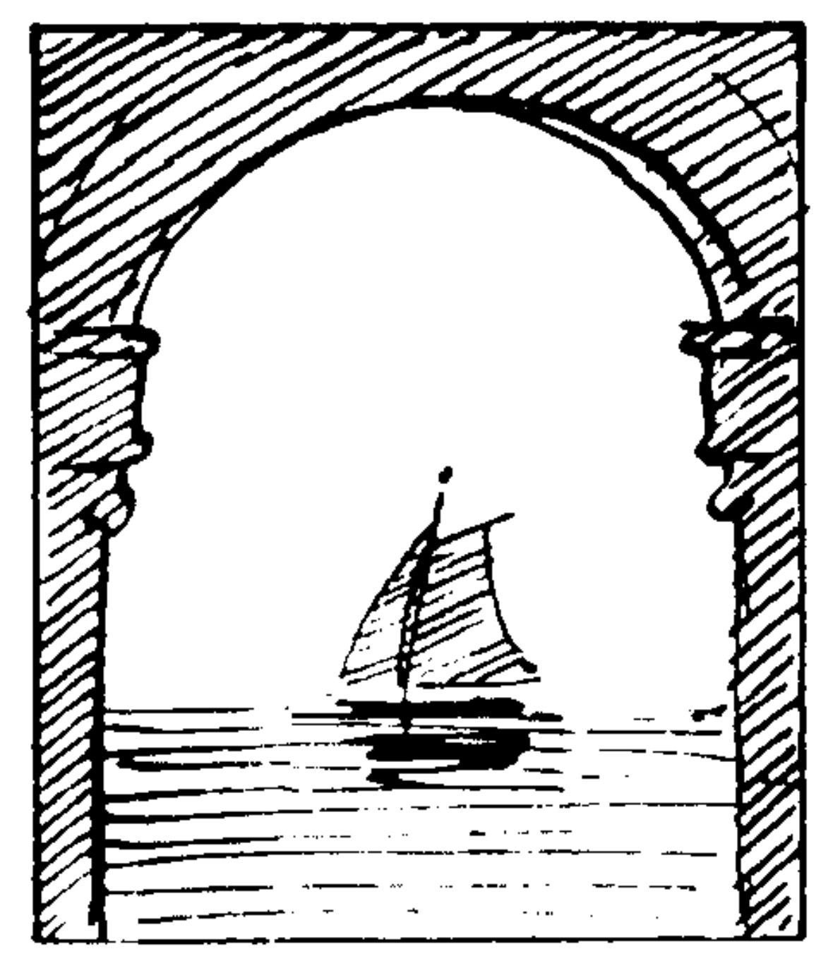
A symmetrical composition is shown in the upper drawing. The two pillars become a mirror image that frames the ship, creating the effect that the ship may not be moving.
Symmetry in interface design occurs in different ways and not always needed to be perfect. Some layouts may use equal blocks of information on cards or simply have a large container for text and images that fills the entire width of the screen. Other compositions also opt for a hybrid proposal where some levels are symmetrical but others asymmetrical. Let's see some examples applied to interfaces.

On the Maersk website, the elements have a symmetrical layout where the greatest visual weight is in the center. The human face provides a great symmetrical element that, when highlighted in red, takes the main hierarchy. The secondary elements are located at the same height and the main text "Disconnected" is centrally aligned. The balance becomes flawless.
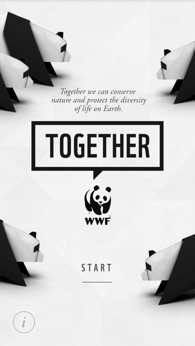
In the WWF app the visual weight is distributed in a balanced way with four elements of great visual weight (pandas). It is interesting that they should not be exactly the same in position to maintain a symmetrical balance, since the view will not capture such details. In the center, the main message "Together" is framed in a black rectangle, balancing and tying up the composition.
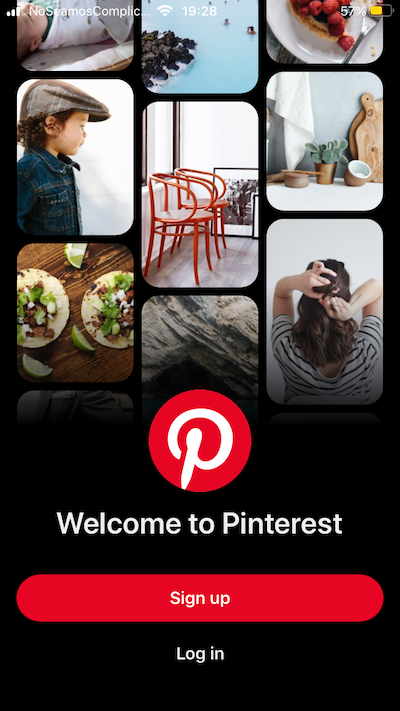
In the Pinterest app, three columns of the same width are shown, but with a different horizontal axis. We can say that this design combines symmetry with asymmetry to give a balanced but dynamic layout. The logo, the call to action, and the texts are centrally aligned to finish balancing the composition (credit image: Pinterest).
It is clear that seeing these examples one can have a symmetrical and stable structure but also interesting to look at, with certain elements that contribute to dynamism and movement.
Asymmetry
Asymmetry in design is the uneven distribution of various elements in an area until they balance out. In nature, for example, mountains are balanced even if their shape is irregular, the fiddler crab has claws of different sizes. Modern architecture is also known for introducing various asymmetrical elements that become very pleasing to the eye. It is also interesting that the asymmetry allows greater freedom of composition and hierarchical organization of the elements.

In the upper drawing, an asymmetric layout can be seen, which places one pillar on the left and the window framing the boat but outside the safe area of the picture. This distribution could create the illusion that the ship is in motion (credit image: I. C. McManus).
Asymmetry in interface design is used to create concepts that are more creative, less formal, and with text blocks that are easy to get by sight. Its hierarchy is marked sometimes by a large text, a prominent image, or an illustration. The layout in this case can respect a grid of twelve columns but the elements tend to occupy them irregularly. Let's look at some examples of asymmetry in interface design.
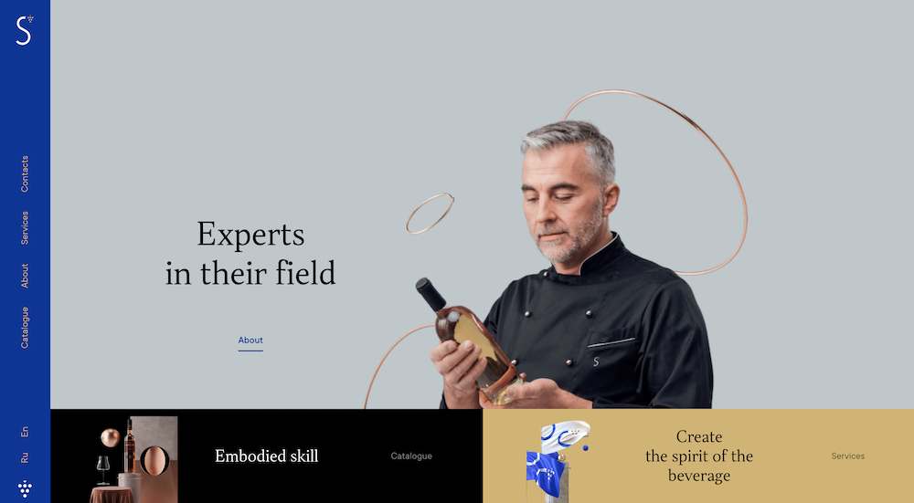
In this example, the visual weight falls on the photo of the man holding the bottle. As can be seen, this is not located in the middle of the composition, but on the right side, so to create balance the designer added a blue bar on the left side. The asymmetry, therefore, seeks a balance hidden in the design.
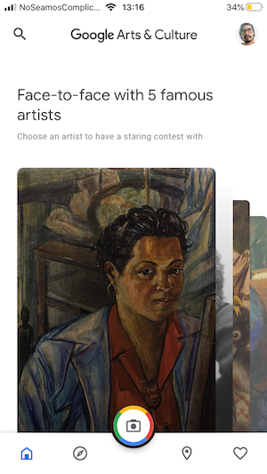
In this Google Art and Culture screenshot, we see that the text "face to face ..." is aligned to the left, serving as a counterweight to the four cards (paintings) that emerge from the right. The bottom bar is, on the other hand, a symmetrical element, having the camera in the center and two icons on each side.

On the homepage of the Airbnb app we have another interesting example of asymmetry. Where the primary message has an alienation to the left, creating the need to balance the composition also to the right. It accomplishes this with an illustration of a home in warm colors, a smart choice as the background has a colder/neutral color palette. Thanks to this, the contrast creates the necessary visual weight.
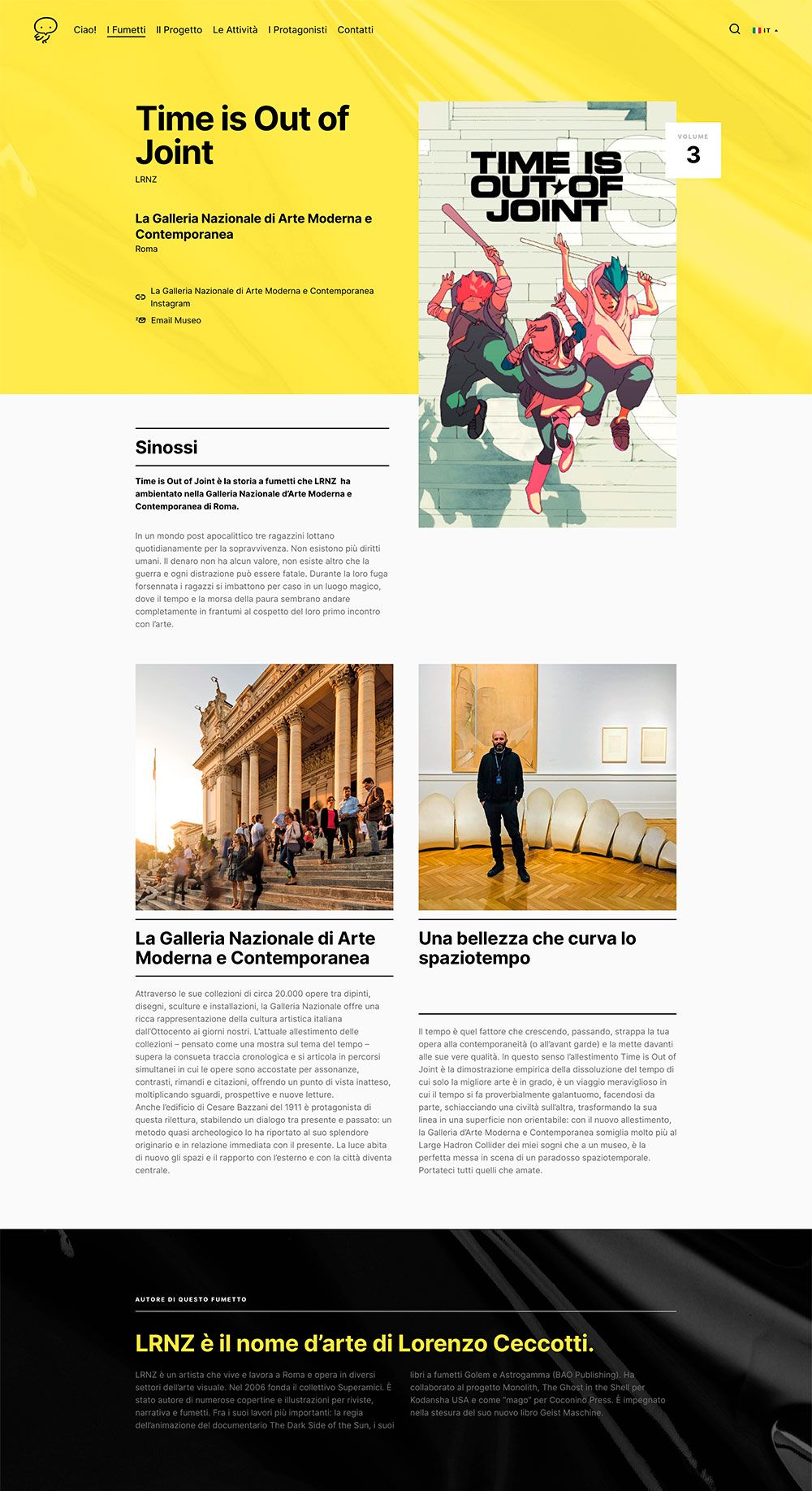
On the Fumettinei Museum website, asymmetry is applied on the first level, with an image that breaks the yellow area and has greater visual weight. The next level compensates for this distribution with a symmetric layout.
Here and in the previous examples, we can see that the combination of symmetry and asymmetry in one screen is common in UI design, it makes the user's visual journey more active and maintains an orderly but dynamic rhythm at the same time. Using both, the tempo of the visual journey will be richer and more interesting to the mind.
Conclusions
You can see from the examples, that using symmetry or asymmetry always comes down to the concepts of balance, tempo, and intent. Balance is an essential factor in web design. Every screen in an interface is the result of a set of components that coexist and interact with each other in a defined area, between which visual tensions are created by the different characteristics of each one of them (sizes, depth, colors, icons, illustrations). When this set of characteristics generates a stable composition, it can be said that the composition is in balance. In conclusion, the symmetric composition is simple, formal, has a lot of force and order. It can give us an idea of something rigid, cold, and static. While the asymmetrical composition can convey tension, dynamism, joy, vitality, and movement.
The use of symmetrical or asymmetrical elements and screens comes from the intent that the designer has for that element and how they want to draw attention and guide the viewer through the interface or a website.
The best way to learn how to use these principles is to carefully study other designer’s cases and learn how they are creating “tempo” and how mixing symmetry and asymmetry together, or using them one after the other, helps our attention to stay on the page and be aesthetically pleasing. And do not forget, that testing is essential nowadays!
Web-sites to be inspired by:
Kioko Tea - a simple landing with symmetrical-symmetrical-asymmetrical compositions of the blocks.
Travel Agency concept that shows the use of more dynamic blocks followed by more static ones.
References:
Symmetry and asymmetry in aesthetics and the arts by I. C. McManus
Balance 101: how to use symmetry and asymmetry in design by 99 Designs
Symmetry vs. Asymmetry - Recalling basic design principles by Interaction Design Foundation


