Remember back in the old days of the web, when websites were made of tables?
Source code looked a lot like this:
<table>
  <tr>
    <tr></tr>
    <tr></tr>
    <tr></tr>
  </tr>
  <tr>
    <td></td>
    <td></td>
    <td></td>
  </tr>
</table>
Above: a table layout with 3 columns and two rows.
Eventually, we were graced with the <div> element, which is short for "divider", and we were then expected to manipulate layouts with CSS using float: and position: instead.
Why?
Because the <table> element was never a viable solution for creating web layouts. In order for a table to be rendered by the browser, all of the content in all of the rows and columns need to be loaded first, which can give the impression that a website is loading slowly (it's recommended that you don't delay the rendering of content, to aid what we call perceived performance). Given how much users hate to wait around, this isn't ideal at all. Tables also don't play nice with responsive layouts (at least ones that are somewhat complex in nature).
So we should be using
<div>s?
Even though <div>s come with their own set of challenges, yes, we should be using <div>s. But we're not making the case for <div>s today; no, today we're making the case for creating layouts using <div>s with CSS Grid, rather than <div>s with positioning and floats. CSS Grid is much more flexible. While tables result in more HTML and less CSS, <div>s result in less HTML and more CSS, but by using the new-ish CSS Grid features, we can have a much smaller codebase all-round and even come up with some pretty exciting layouts that ordinarily we would have deemed too complex to even consider. Let's take a quick look.
Creating Rows and Columns with CSS Grid
CSS Grid starts with: display:grid;.
Consider this snippet:
#grid {
  display: grid;
  grid-template-columns: 1fr 1fr 1fr;
  grid-template-rows: 1fr 1fr 1fr;
}
// or
#grid {
  display: grid;
  grid-template-columns: repeat(3, 1fr);
  grid-template-rows: repeat(3, 1fr);
}
<div id="grid">
  <div>Column 1, row 1</div>
  <div>Column 2, row 1</div>
  <div>Column 3, row 1</div>
  <div>Column 1, row 2</div>
  <div>Column 2, row 2</div>
  <div>Column 3, row 3</div>
</div>
In the CSS code snippet above, grid-template-columns: and grid-template-rows: will define the number of columns and rows in the grid, where the example above uses a new unit called "fr" (which means "fractional") to define a grid with 3 rows and 3 columns.

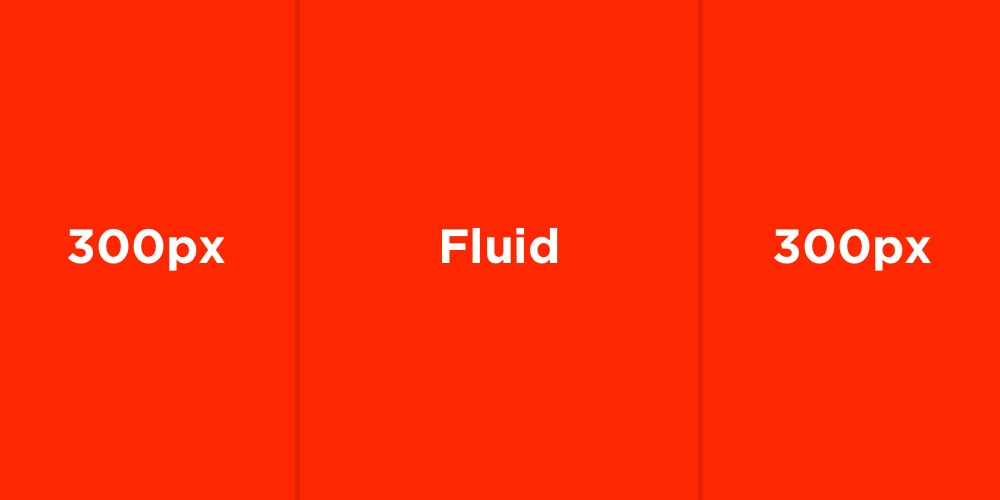
Other units of measurement (px, em, et cetera) will have a unique advantage though, allowing us to create some rows and columns with fixed widths, while declaring others as fluid with auto, a technique that's proven to be unreliable with <table>s and <div>s. The example below creates two 300px-width sidebars, where the main body of content is fluid/responsive.
#grid {
  display: grid;
  grid-template-columns: 300px auto 300px;
}
<div id="grid">
  <div>300px</div>
  <div>Fluid</div>
  <div>300px</div>
</div>
Making Cells Span Multiple Cells
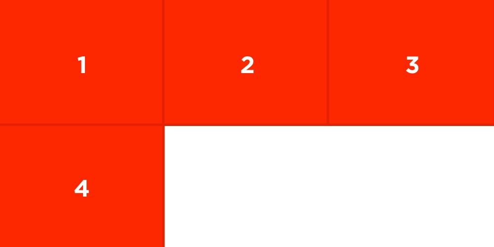
Let's assume that one cell needs to span the width of three cells (100% width in this case), and those cells need to be blue, but since there are actually four cells and only three columns in this example, the fourth cell would ordinarily be forced onto a row by itself. Poor row.
#grid {
  display: grid;
  grid-template-columns: 1fr 1fr 1fr;
  //or grid-template-columns: repeat(3, 1fr);
}
#grid .blue {
	background: blue;
}
<div id="grid">
  <div class="blue">1</div>
  <div>2</div>
  <div>3</div>
  <div>4</div>
</div>
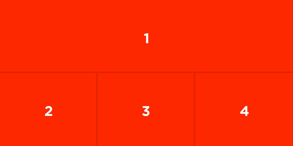
However, with grid-column-start: and grid-column-end: we can ensure that the blue cell spans through cells 1-to-3. Notice that there are two different ways of going about it, where the span value in the 2nd example means "span 3 cells" (the 4th cell is no longer on its own).
Note: grid-column-end: 4; means "span to the 4th grid line", not "span 4 cells".
#grid .blue {
	grid-column-start: 1;
	grid-column-end: 4;
	background: blue;
}
// or
#grid .blue {
	grid-column-start: 1;
	grid-column-end: span 3;
	background: blue;
}
<div id="grid">
  <div class="blue">1</div>
  <div>2</div>
  <div>3</div>
  <div>4</div>
</div>
We can also use the shorthand property, grid-column:. In the example below, this says that the .blue cell will start in the 1st column and span for an additional 3 (same as above).
#grid .blue {
	grid-column: 1 / span 3;
}
<div id="grid">
  <div class="blue">1</div>
  <div>2</div>
  <div>3</div>
  <div>4</div>
</div>
And finally, you can use the shorthand property grid-area; to style both rows and columns together. By now you should be realizing how mighty CSS Grid can be, despite its tiny CSS.
Grid area:
#grid .blue {
	grid-area: grid-column-start / grid-column-end / grid-row-start / grid-row-end;
}
Reordering the Grid
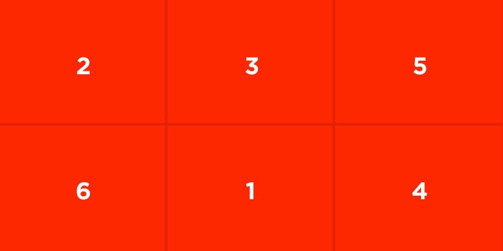
As mentioned earlier, we can reorder cells in a grid to our liking. This is something that we were never able to do with <table>s, where cells would instead be rendered according to how they were ordered in the source code. order: works similarly to z-index: (it orders by priority).
.appear-first {
	order: 0;
}
.appear-last {
	order: 1;
}
<div>
	<div class="appear-last">1</div>
	<div class="appear-first">2</div>
	<div class="appear-first">3</div>
	<div class="appear-last">4</div>
	<div class="appear-first">5</div>
	<div class="appear-first">6</div>
</div>
Grid Gap
We'll need to add spacing between the different cells from time to time. grid-gap: works similarly to border-spacing:, the property we used with <table>s way back when.
grid-gap: applies spacing to the insides of cells.
Conclusion
CSS Grid can be confusing at first, because it's like a mixture of <div>s and <table>s together, but they're really useful once you understand how they work. You can build entire website layouts with CSS Grid, and it even works alongside CSS Flexbox.
